- Ballot design should be simple and straightforward to ensure voters understand for whom and for what they are casting their votes.
- Ballots should be written in clear, plain language.
- Ballot design should focus on the ABCs: Accuracy, Brevity and Clarity.
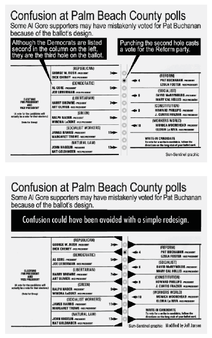
It seems almost too basic to have to state that the ballots used for voting must be simple and straightforward. Yet, past experience has shown that ballot confusion is common and can have disastrous consequences. In the 2000 Presidential election, poor ballot design caused confusion among Florida voters, resulting in some voters casting their ballot for a different candidate than they intended.1 The Florida ballot, shown below, required voters to punch a circle next to the candidate for whom they wanted to cast their vote. However, poor layout resulted in confusion over which circle went with which candidate. As a result, many voters cast their vote for the wrong candidate.
Back to full report
 However, as shown on the following page, a simple fix would have made the ballot clearer.
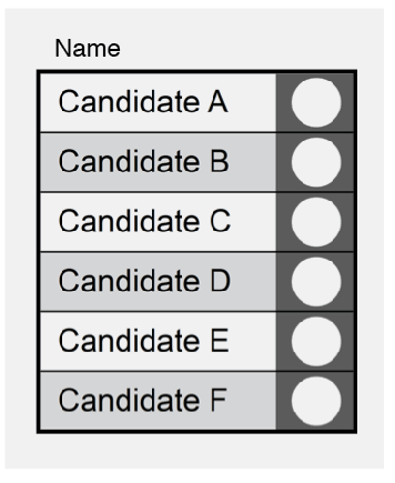
Yet, even though the second ballot may be less confusing than the original, it is still confusing. Too many graphic symbols crowd the ballot and the two columns of candidates make it more likely that a voter picks a candidate different from her intention. Simply listing all the candidates straight down in one column would have made the ballot far clearer, as the sample ballot below shows.2
Poor ballot design can also result in “overvotes,” where voting machines detect more than one candidate selected for a contest.3 In these cases, no vote is recorded for the contest, regardless of the voter’s actual intent.4 Poor ballot design also disproportionately affects voters who are poor, elderly, disabled, and new to voting.5 Research shows that for 90 percent of the adult population to be able to read and understand the content, the ballot should be written at a 3rd grade reading level.6
 There are few set standards for ballot design in state law, but Minnesota and Washington have worked to ensure their ballots are accessible and easy to understand for their voters. Minnesota worked with design professionals and usability experts to redesign the instructions on the absentee voter submission envelope after more than 4,000 absentee ballots were not counted in 2008, mainly because voters failed to sign their ballot.7
Minnesota’s efforts were successful and as a result of the redesign, the number of unsigned absentee ballots decreased by 79 percent in 2010. Washington State passed a bill in 2010 that requires ballots to have a clear delineation between the instructions and the area to vote.8 The Secretary of State must also establish standards for ballot design and layout. These steps help ensure that the voter experience with ballots are in the forefront of priorities when designing ballots.
Principles of Ballot Design
The good news is that creating ballots that are easy to understand is relatively simple. Ballot designers can think of the ABCs for ballot design: Accuracy, Brevity and Clarity:
Accuracy
- Ballots should use fill-in-the-oval rather than connect-the-arrow options.
- Instructions should be included on the ballot itself that define and warn about the consequences of casting a spoiled ballot and explain how to correct a spoiled ballot.
- A ballot design team for ballots and election materials should be assembled and potential ballots tested with voters to determine accurate and understandable language translation, best voter design preference, and maximum usability.9
Brevity
- There should be only one language per ballot.
- Each contest and measure should be on its own page when states use a Direct Recording Electronic (DRE) voting system.
- Voting instructions and displayed voting materials should be written at a 3rd grade reading level.
Clarity
- Reconfiguration of the write-in line should be considered to prevent voters from selecting a candidate and then writing the same name on the write-in line.
- Ballots and supporting materials should use plain language, clear colors and fonts, and universally understood icons.10
- Ballots should only have one or two different colors to streamline design.
- Candidates for the same office should not be listed in multiple columns or on multiple ballot pages.
Back to full report
Endnotes
- Jennifer Tidwell, The Palm Beach Ballot Fiasco (or, How Poor Design Undermines Democracy), (Nov. 8, 2000), available at http://www.mit.edu/~jtidwell/ballot_design.html. ↩
- TacklingTomfoolery.com, Tiny Bubbles, (2010), available at http://tacklingtomfoolery.com/blog1/wp-content/uploads/2010/11/tiny-bubbles.png. ↩
- John Travis, Overnotes: Phantoms of the Ballot Box, (May 9, 2012), available at http://www.brennancenter.org/blog/overvotes-phantoms-ballot-box. ↩
- Ibid. ↩
- Lawrence Norden, et.al., Better Ballots, (Jul. 21, 2008), available at http://www.brennancenter.org/sites/default/files/legacy/Democracy/Better%20Ballots.pdf. ↩
- National Center for Educational Statistics, A First Look at the Literacy of America’s Adults in the 21st century, (2006), available at http://nces.ed.gov/NAAL/PDF/2006470.PDF ↩
- Jimmy Stamp, Redesigning the Vote, (November 12, 2012), available at http://blogs.smithsonianmag.com/design/2012/11/redesigning-the-vote/. ↩
- The Seattle Times, Washington Gov. Gregoire Signs Ballot Design Law, (Mar. 12, 2010), available at http://seattletimes.com/html/localnews/2011332621_apwaxgrballotdesign1stldwritethru.html. ↩
- Janice Redish et al., Report of Findings: Use of Language in Ballot Instructions, (May 2009) available at http://civicdesigning.org/wp-content/uploads/2012/06/NISTIR-7556.pdf. ↩
- “A document is in ‘plain language’ when the users of that document can quickly and easily—find what they need, understand what they find, and act appropriately on that understanding;” National Center for Educational Statistics, A First Look at the Literacy of America’s Adults. ↩
Back to full report